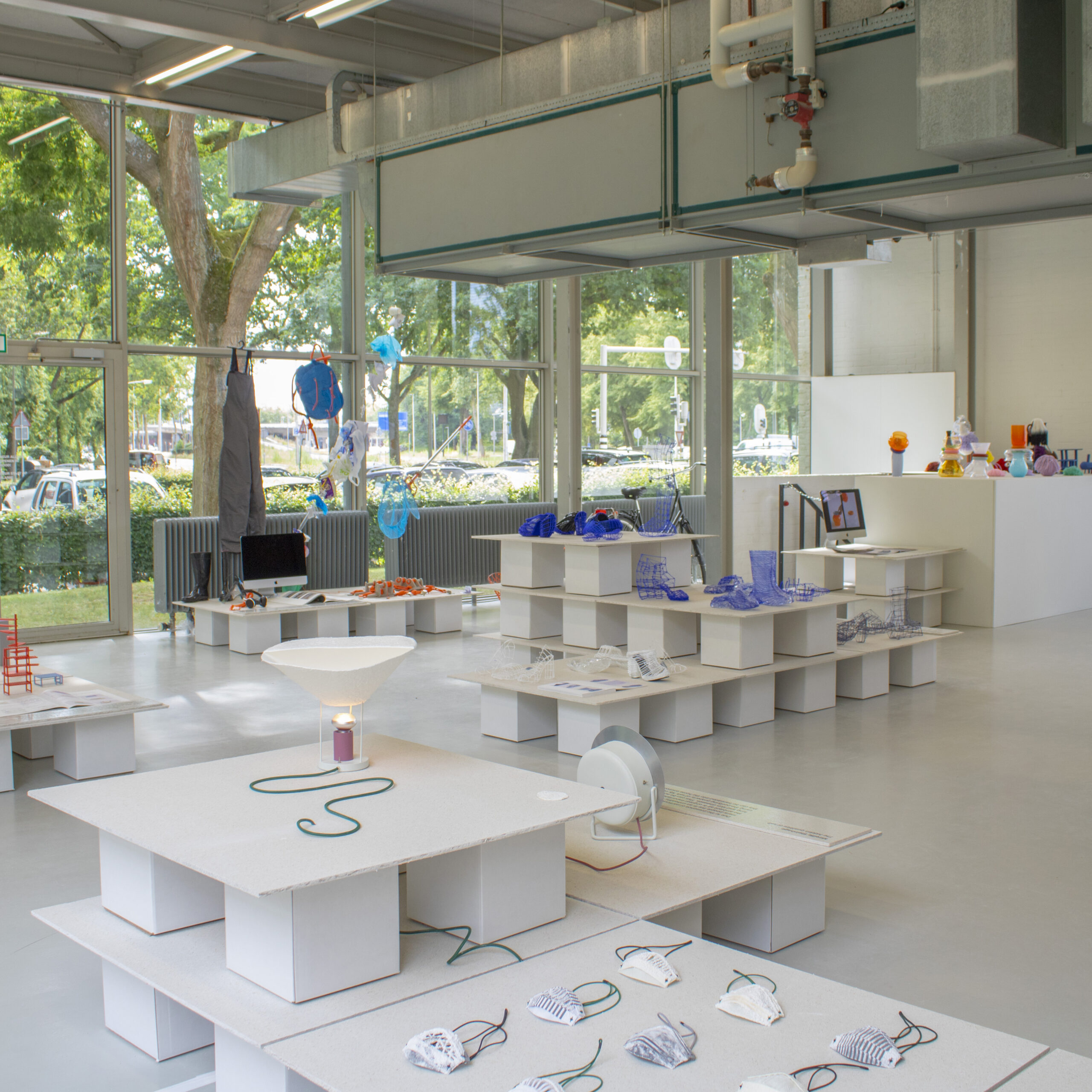
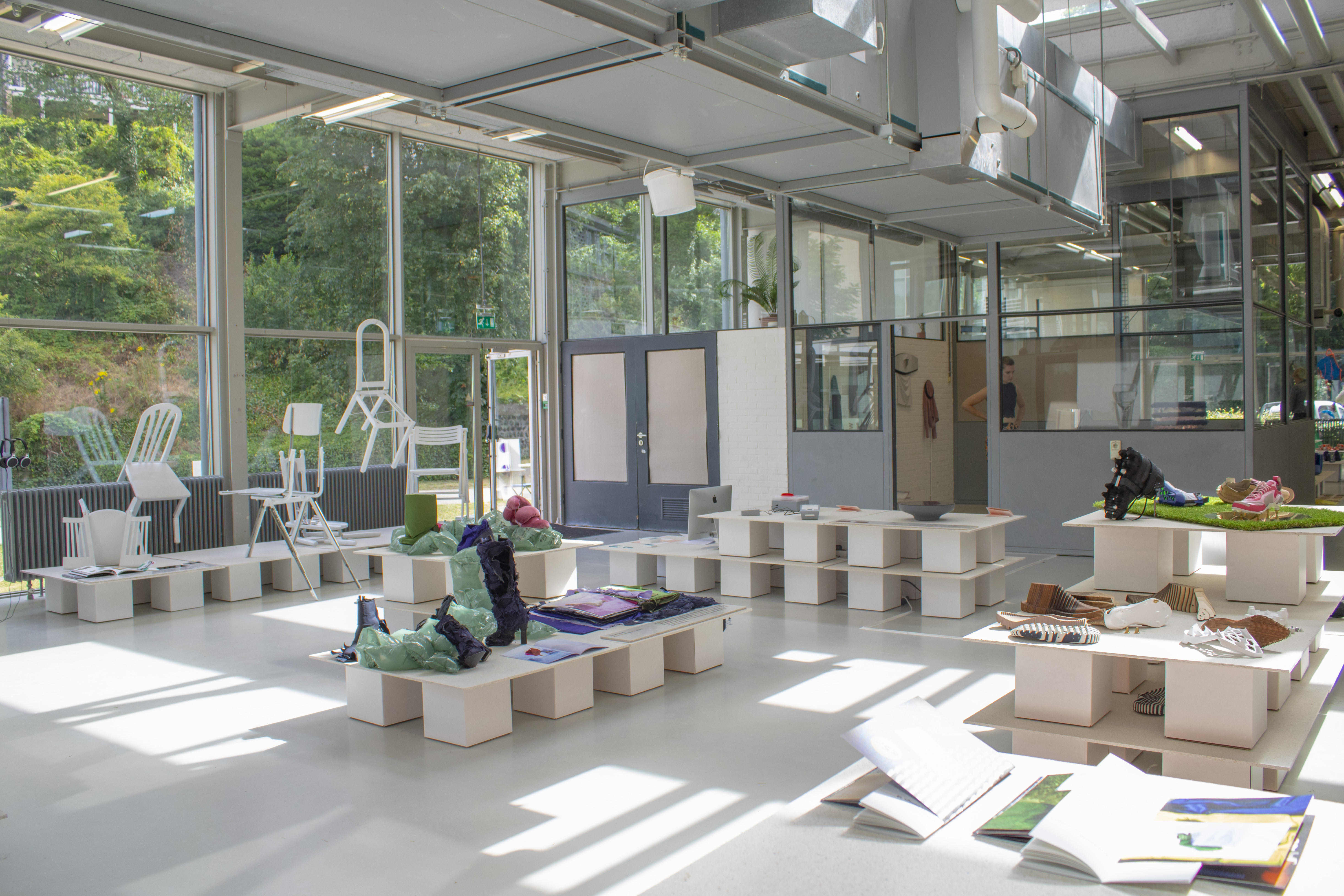
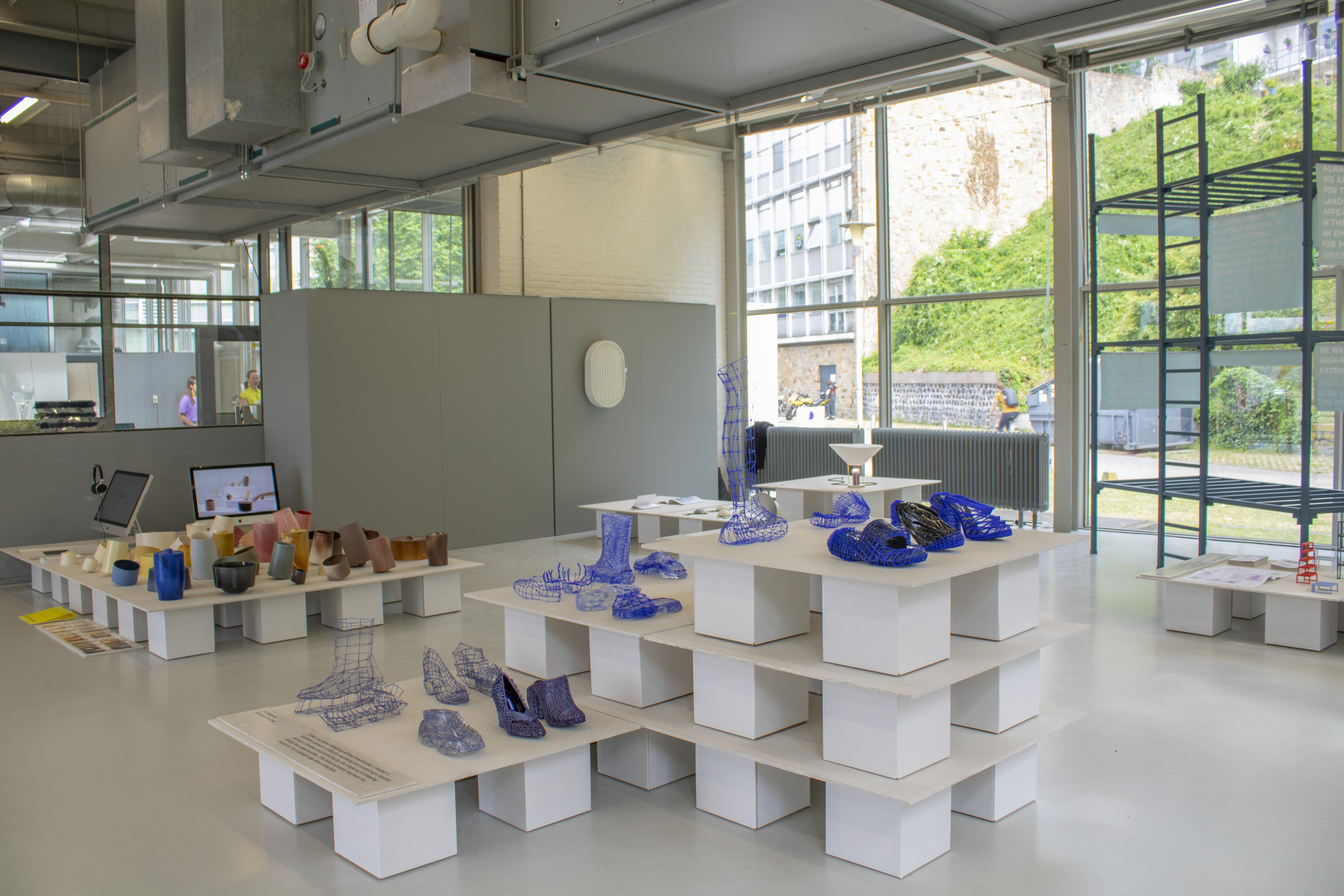
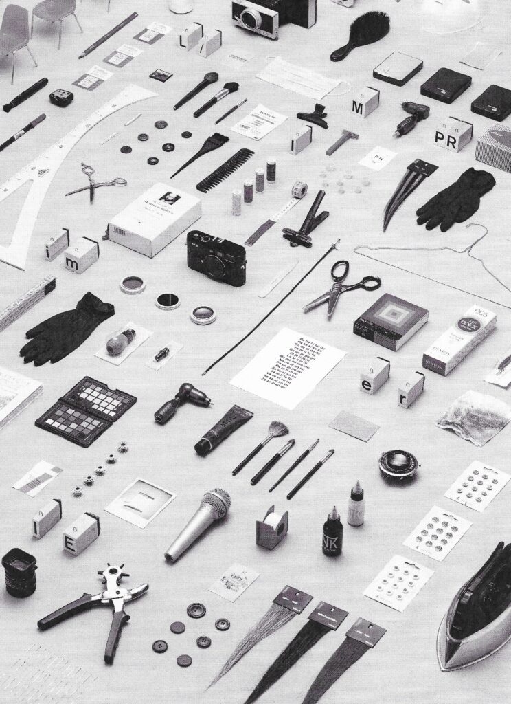
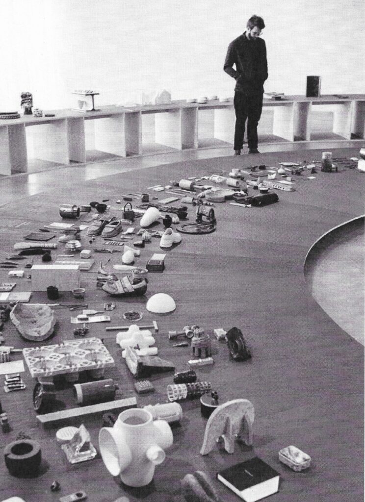
The concept for the Artez Product design finals exhibition was to give the visitor an idea of the process, tools and materials the finalists used to make the final work happen! We did this by picking up their complete studios and displaying all their tools, furniture and materials in the hallway leading up to the actual end result.
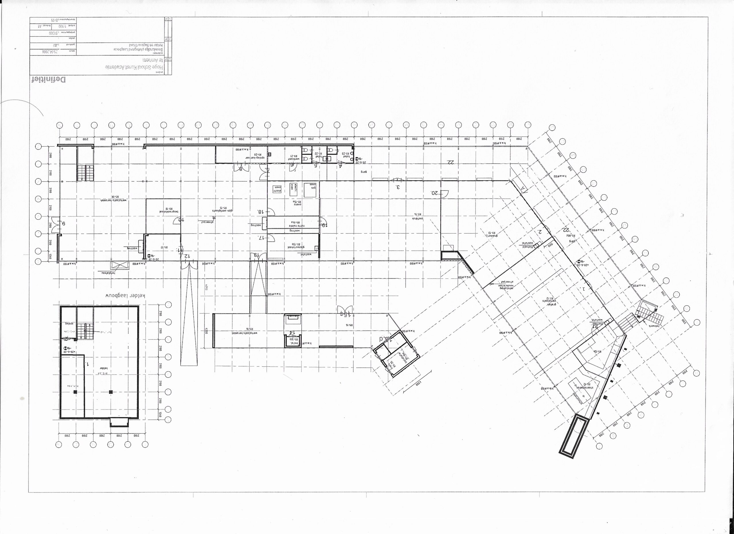
As for the exhibition itself. We looked for inspiration towards the history of the available space. Originally designed by Gerrit Rietveld in the 1920s, the building existed completely on a very precise grid.
This grid became the very basis for the pedestals used to display the work. Every pedestal lines up in this grid, this together with the color scheme of the building, makes sure they disappear into the existing space giving all the attention to the works of the students.
